
What Is a Color Blindness Simulator?
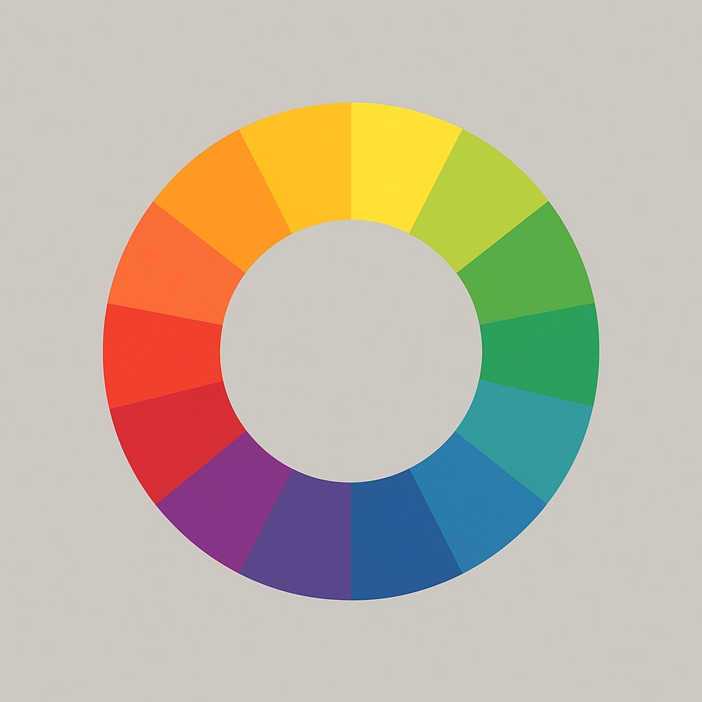
A color blindness simulator lets you preview how images, UI mockups, and design assets appear to people with color vision deficiencies (CVD). With red–green CVD affecting up to 8% of males and 0.5% of females globally, testing your visuals for accessibility is not optional—it is a core part of inclusive design. This tool supports four simulation types: protanopia (red-blind), deuteranopia (green-blind), tritanopia (blue-blind), and achromatopsia (complete color blindness), so you can catch problematic color pairings before they reach production.
How to Simulate Color Blindness
Upload a screenshot, photo, or design file—or choose one of the built-in sample images to get started instantly. Select a simulation type from the sidebar to see a side-by-side comparison of the original and the simulated version. Switch between protanopia, deuteranopia, tritanopia, and achromatopsia to evaluate how each deficiency affects your design. Once you spot an issue, export the comparison image for documentation or team review.
Why Test for Color Blind Accessibility?
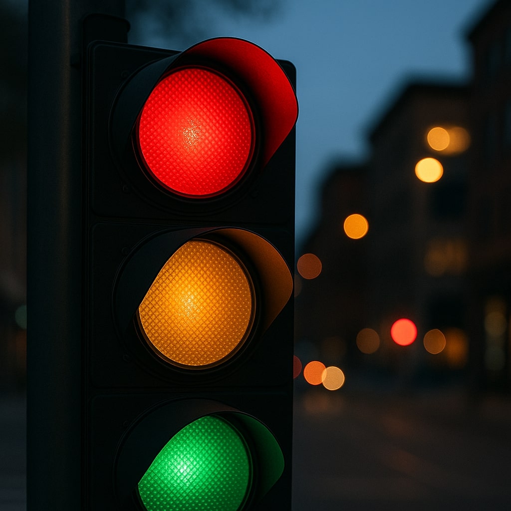
Relying on color alone to communicate meaning—like using only red and green to indicate error and success states—excludes a significant portion of your audience. The Web Content Accessibility Guidelines (WCAG) criterion 1.4.1 requires that color is never the sole method of conveying information. A color vision deficiency simulator helps you identify exactly where your design falls short, so you can add supplementary cues like icons, patterns, or text labels.
Beyond compliance, accessible color choices improve usability for everyone. High-contrast, well-differentiated palettes are easier to read in bright sunlight, on low-quality displays, and for aging users whose color discrimination naturally declines.
Practical Tips for Accessible Color Design
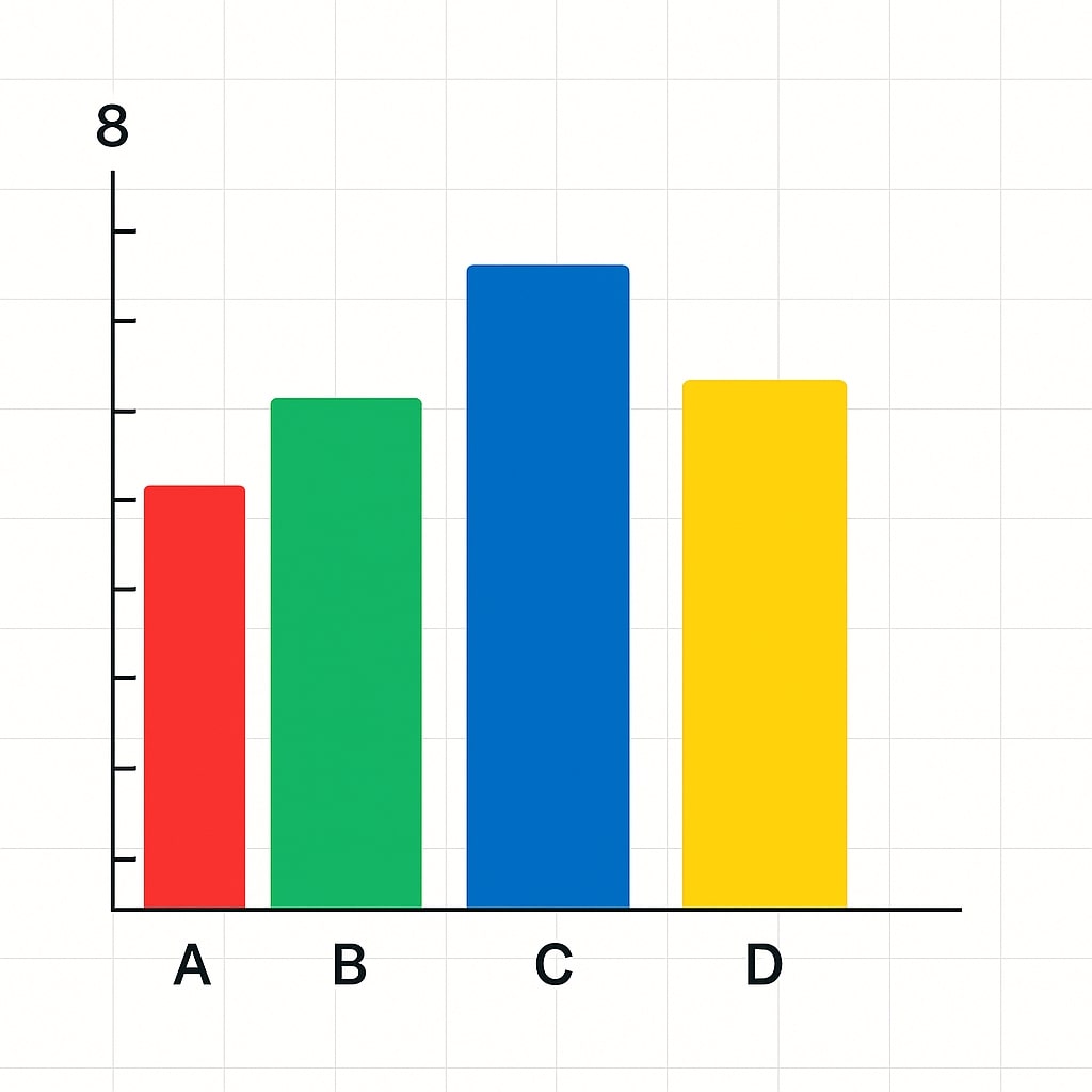
Start by running your key screens through all four simulation modes. Pay special attention to interactive elements—buttons, form states, chart series, and status indicators—since these carry critical meaning. If two colors become indistinguishable under simulation, you have several options: increase the lightness contrast between them, add a shape or icon as a secondary signal, or choose an entirely different hue.
After identifying and fixing issues here, validate your updated color pairs in the WCAG contrast checker to confirm they meet AA or AAA thresholds. For a broader audit across an entire palette, use the palette accessibility matrix to test every foreground–background combination at once. If you need to refine specific hues without breaking your brand palette, the color harmony generator can suggest balanced alternatives.
Common Pitfalls to Avoid
Red and green buttons placed side by side are the most frequent offender—under protanopia or deuteranopia, both can appear as a similar muddy tone. Chart legends that rely solely on color-coded lines without markers or labels are another common issue. Finally, avoid using saturated blues and purples for critical distinctions, as these can merge under tritanopia. Always pair color with at least one other visual differentiator, and simulate color blindness on every design iteration to stay ahead of problems.